2) Write a detailed analysis of this Doctor Who magazine front cover using the 12 key conventions from the notes. For each one, explain the purpose of the convention and the effect or impact it has on the audience.
THE TITLE OF PUBLICATION
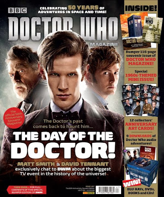
The tile of publication is 'DOCTOR WHO' this is written in a big bright font different to the rest of the text on the front page, this highlights the significance of it. The purpose of the title publication is so that the audience can easily identify the magazine from a shelf. r. Although it is overlapped by the Doctors head, it is still readable and still allows the audience to recognise it, so the overlapping does not cause a problem, of it being unreadable.
THE SLOGAN
THE SLOGAN
The slogan is located in the middle of the page and says ''The Doctors past comes back to haunt him.', which is short, snappy and to the point, it is also in bright colours in a bigger text than usual. The main purpose of it is to engage the viewers and create an enigma code of what will happen, creating suspense. The slogan also conveys a hints of what will further occur in the series. This also helps the audience decide whether they want to read it or not. The slogan usually contains verbs which intensifies the narrative, reinforcing the genre.
THE CENTRAL IMAGE
FREE OFFERTHE CENTRAL IMAGE
The central image is the most significant out of the whole front page, as it engages the reader without words, communication occurs through the image.The central image is of the doctor in different forms, which has to relevant to what the front page is about, and what is to come inside. In this the facial expressions have to be clear in order to convey what's happening, to further create enigma codes about what why all three of them are in the central image, reinforcing the slogan about the past. The fact that there is a ray of light coming through the back insinuates that something extraordinary or hopeful will occur, again enforcing another enigma code. This also enhances the genre of the magazine so that its looks appealing to people who are not so interested in Dr who however like the genre.
FLASH/COVER LINE/ CENTRAL LINE
The flash line is important in the front page of the magazine purely because it is the 2nd thing the audience looks at, this also plays a huge role in attracting the audience. The cover line is bold and takes up alot of the space in the front page, which allows the audience to focus around it eg 'The day of the doctor' insinuates that this an usual event will unfold, it captures the audiences attention as it implies that the episode will be based on the main star. This enhances the vitality of the Doctor and allows us to suture and trigger thoughts about what will happen.
The magazine offers a chance to win blu-rays, DVDs, books and CDs. This is is an effective way to engage the reader with the magazine, sometimes this attracts the the audience more then the actual magazine. The prizes that have been put forth increase the chance for the audience to purchase the magazine.
COLOUR SCHEME
The colour scheme enhances the mood or particular vibe of the magazine, the colour of the magazine cover page has a a huge impact on how captivated the audience is. The colour scheme is usually just a few colours that connote a particular message or work hand in hand with the logo. The colour scheme overall combines the colours to to create a certain impression. For instance the colour scheme in the Doctor Who magazine are dark colours like black and grey however lighter colours are embedded into it too. the colours are symbolic to the narrative and characters of the series.
BAR CODE:
This is usually situated on the bottom of the front cover, this indicates that it for sale and is for selling purposes.
No comments:
Post a Comment